
Wednesday, December 4, 2013
Extended time poses 12-3-13

Friday, November 22, 2013
Drawing #2 11/19/13

Life Drawing CAM 11/19/13

Friday, October 18, 2013
Pose 3 10/15/13

Pose 2 10/15/13


CAM Life Drawing 10/15/13 15 minute pose

Wednesday, October 2, 2013
10-1-13 Extended Pose Night


Saturday, August 24, 2013
Playing catch-up the latest

Last drawing night's work - trying to work looser and be more expressive while trying to render the figure accurately. Pastel on toned paper.
Playing catch-up


Playing catch-up

This one was done just a few weeks ago - maybe July sometime. I thought when I was doing it that it was about the hands - hands that I hadn't rendered well. I tinkered with it a bit, and am a bit happier.
Saturday, May 4, 2013

Friday, April 26, 2013


Life Drawing at CAM 4-23-2013

Friday, April 19, 2013
Life Drawing 4-16-13
I tried out the new pastels that came with my award and they are fun. They are Diane Townsend Terrages - they have a fine pumice combined with the pigment and binder, and the idea is that they "open" the paper surface (abrade is the action) to allow smoother paper to accept more pastel. They can be used as any other pastel brand and can be combined with other pastels as per usual. I really appreciate this gift as I would probably not have tried them (they ain't cheap! ;-[ ), and they are different. I did several drawings on prepared paper, and on Canson MiTientes as is this one - and overall, I think this is the better drawing.


Wednesday, April 10, 2013
Life Drawing 4-9-13
These last 2 are also on treated paper, and they were both difficult poses from my view - the last one I think I was just wore out!


Life Drawing 4-9-13 #2
This is the first on gessoed paper and a 25 minute drawing - I like this one the best, it's more accurate and has a lot of drama.


Life Drawing 4-9-13 #1
Spring has sprung! Fresh palette, new model! For the last 3, I was working on paper treated with Liquitex Clear Gesso which dries with a tooth, and I swirled in different watercolors to create a ready-made background - which in itself creates another dimension of challenge. These first 2 are on plain smooth paper, 15 minutes each.
 |
| #1 smooth paper |
 |
| #2 smooth paper |
Friday, March 15, 2013
The last pose of 3-12-13

Life Drawing #4 of 3-12-13


3-12-13 Life Drawing Night
After having to take off a couple weeks, I went into the evening with no expectations. I just decided I would change my palette to my favorite colors and go with the flow. Sometimes I surprise myself and do better than expected when I don't set expectations! Just relaxing and having fun!
 This one, and the next two were done on smooth drawing paper and using NuPastels and Schminke dry pastels.

Thursday, February 21, 2013
CAM Life Drawing 2-19-2013
I was not happy with the first drawings of the evening, I did not get the drawing right from the get-go and I got way too far along before before I decided I needed to fix them. So I tinkered with some rather strong complementary palette colors, just to see what they would do. I'm working in oil sticks still and I'm still learning what to do with them. But this drawing was the last one of the evening and I focused on getting it right from the start and then building up the form through color, but still not explaining every little detail. This one works for me better than the others from this night.
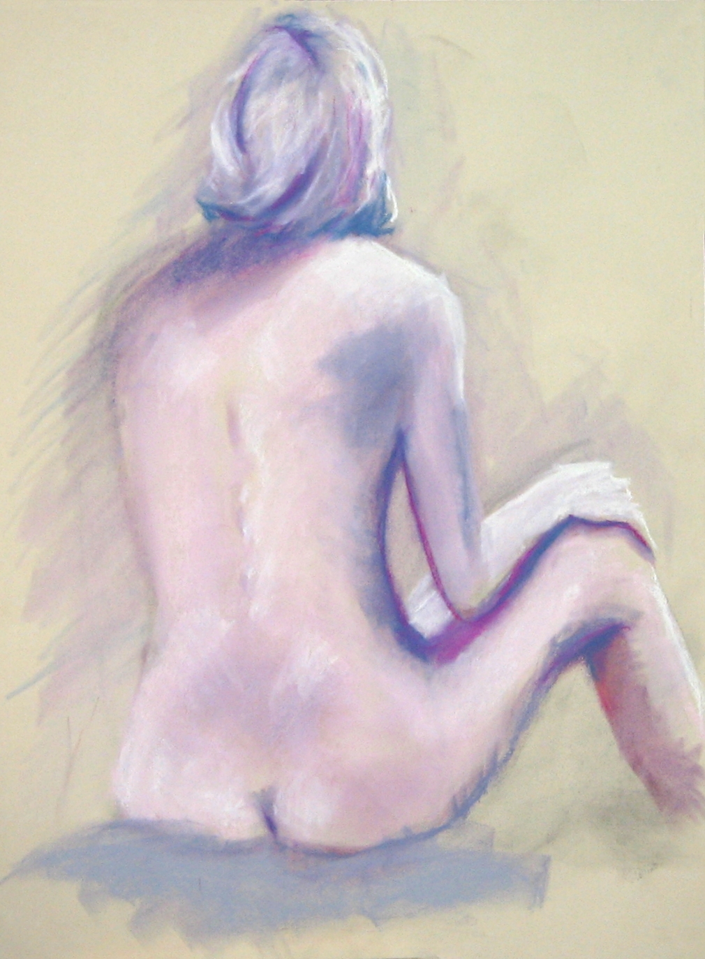
 I'm getting good at backs! I did one almost like this last week!

Wednesday, February 13, 2013
Long pose #3 2-12-2013

Long pose #2 2-12-2013
Long poses 2-12-2013

2-12-2013 Drawings
The intention I set for tonight was to challenge myself in a media I have used before but not too effectively and to use a complementary color palette to develop the figure. These first 2 are 15 minute drawings, starting out with charcoal sketch lines, then filled in with color on smooth drawing paper - no gesso. I feel like the drawings look stiff here - but it is the long warm-up - that's how I look at it.


Wednesday, February 6, 2013

Long Pose Night 2-5-13

Thursday, January 31, 2013
1--29-2013 drawing 3
This was the last, longest pose and it may be difficult to see on your monitor, but there is some fun things going on with scumbling of color over color on treated paper, which creates not only some interesting texture, but also some dimension.
 Not a perfectly proportioned figure but interesting.

1-29-13 drawing 2

January 29, 2013 CAM Life Drawing
I definitely find that I need to establish an intention to accomplish "something" when I draw - and I'm thinking that applies to "everything" really. While I think these drawings are not finished products by any stretch of the imagination - there are some things about them that I can continue on with at the next sessions, so I'll have to review them beforehand to see where it goes, hopefully.

Fifteen minute drawing
Friday, January 25, 2013

Drawings from 2 weeks of January

Thursday, January 10, 2013
2nd drawing of 2013

The first drawing night of the 2013
 Used pastels on gessoed paper. A bit stiff, my hand-eye coordination is OFF!
Subscribe to:
Posts (Atom)