Welcome

This is about improving our drawing experiences, and hopefully have something to build on and expand our critiques. If you have a drawing you want to talk about, you should be able to post pictures and comments. If you have difficulty, just email me! Should be fun! Thanks!

Thursday, December 20, 2012

CAM Life Draw 12-18-12 #2

Still exploring the use of pastel in a painterly texture and the complementary palette. Ah, with the holidays, perhaps I need to rest my eyes and take a freshen up breather. . .

CAM Life Draw 12-18-12

Started out the evening feeling disconnected to my normal focus, couldn't get in the groove for some reason. Gestures didn't help loosen me up, 15 minute drawings were STIFF, so my hopes for the evening were quickly diminishing. And I couldn't figure out why - sometimes it just happens and you just have to not be so hard on yourself. I decided I would continue with the palette experiments, but this one isn't too far removed from what I have done already. So I decided to just go with it, including the mirror image setup. Not a fabulous or accurate drawing but some interesting elements in it - I particularly like the hands and foot design.

Monday, December 17, 2012

CAM LD #4

The last long drawing of the evening, and I switched from "realistic" skin tones, to just a palette experiment. Instead of red-orange for the light skin tones, I used yellow-orange instead - with a good deal more yellow than orange, and used one of my favorite colors in combination: blue-green and blue-violet for the shade areas. The red blanket and light violet-grey background don't quite work here, and there's a few anatomical tweaks (my excuse is she wiggled her upright arm the whole pose), but maybe I can fix it.

CAM LD #3

This time I tried a tetrad palette starting with the light red-orange of the skin, the red-violet shadows, the yellow-orange of the hair and allowing the rich red local color to anchor the whole thing. Interesting.

CAM LD 12-11-12 #2

I have been trying to work looser, but also trying to refresh my past knowledge of color palettes. Tried to render a somewhat local/realistic color but using a kind of split complementary, or a triad palette, using the light red-orange skin tone with a blue-violet shading and a bit of blue-green. Started using a bit of yellow-green in the gray areas and didn't like what it did. That's the purpose of the following drawings as well - interesting problems.

CAM life drawing 12-11-12 #1

This was actually the last 15 minutes of the evening, a quick charcoal on smooth paper - kind of like a cool down, from a tough workout!

Wednesday, December 5, 2012

Not a great drawing, but if you could see it in person, the pastels becomes almost creamy in texture on this paper and it creates a painterly effect - something I will work with in future. It's funny, for every artist there is a unique way to work with this medium (as it is every medium I guess), but standards and rules are more typically followed. I always kind of assumed that papers designed for pastels - many of them have a gritty surface to provide tooth for the pastel to hold onto - would be best for the pastel. But I so like this creamy texture, and so far have not lost much pastel! More to be discovered!

12-4-12 Drawing night

I bought some different paper by accident. I had intended to buy some Strathmore 400 series medium drawing paper, and I got Strathmore 400 series smooth paper, suitable for pen and ink. I first thought "Oh Phooey!" - I don't want to go to all the trouble of taking it back, so I decided to try it. It has a very smooth, almost satiny surface and it warms up to charcoals very nicely. As you will see it behaves well in pastels too - who knew?
This is the first warm-up (15 min) drawing with charcoals and smooth paper.

Saturday, December 1, 2012

Drawing 11-27-12

It has been quite a while since the wheels came off the cart, and I have been able to create anything I thought was worth looking at. This is the final drawing of the night - the others did not promise this ending. Been struggling with an idea about how to start and develop a drawing in a more "painterly" style with pastels, decided to slow down and look instead of jumping in. Had been practicing just blocking in basic areas of color specifically lights and darks, and then refining as time permitted. -This has been good practice but not producing exciting drawings, or even completed drawings, and things have been looking pretty stiff in spite of the idea of loosening up. So in complete frustration, I gave up (mostly); just started responding in a more typical way for me - more spontaneous and voila! - the result! I like this one!

Wednesday, October 10, 2012

October 8, 2012 Part Two

Same situation as the first, a bit stiff, not quite accurate, but developed more color - what a challenge! I struggle with the desire to depict the figure accurately AND do so with expression. The battle continues . . .

October 9, 2012

It is a challenge to draw even one figure sometimes, two figures can be overwhelmingly complex. So the thing to do that works for me is to simplify, simplify. This drawing was the second of three - the first was a 20-minute charcoal, this one was 30 minutes (?), and the last was about an hour with a break in the middle. While this drawing is stiff partly because of the inaccuracies and partly in the apprehensive rendering, I do like the simple blocks of color. - Not too much finish, or too much detail.

Thursday, October 4, 2012

Fallen Angel

This week's drawing was uninspiring until we did this pose. Still not a masterpiece (what IS???), but some interesting things are happening - particularly the way the complementary colors glow when side by side. And except for this one which is interesting, a not great night for me.

Friday, September 28, 2012

9-25-2012

Trying to not smooth out pastel marks so much - let them speak on their own, just trying to be a little freer, simpler. This was a salvageable drawing - the rest are headed for recycling!

Wednesday, September 5, 2012

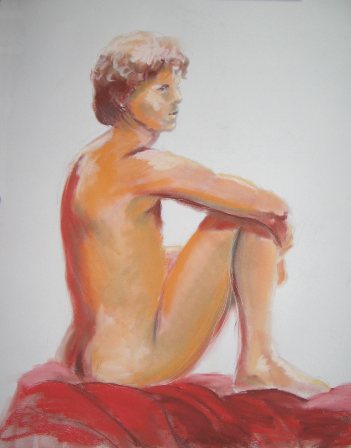
Throw caution to the wind!

And fire away! I was worried I couldn't get the color to read the skin tone right, I was worried I couldn't get the figure on this small (16x20) format, I was worried blah, blah, blah . . . so, I said the heck with it, let's just do it and if it's worse than the first - we'll just scrub them off and have at it again - just like drawing!
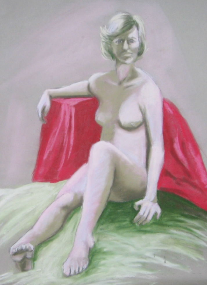
And I really like this red sheet, too!
I am happy with this one.

First time oil of figure drawing

Last week the weather was so bad, I missed one of our favorite models. But this week we had an excellent, new model and hoping he will return again soon!
I started out the night very apprehensive - I was out of my comfort zone and plunging into something I had not done before - oil painting with a live model. I've painted the figure in watercolor, pastel, oil stick, etc. but not with dollops of paint and medium before me, and a bristle brush in my hand. I've painted oils in the studio, even ultra-mini oils which are like playthings. I've painted en plein air (not too successfully very often) in oils, but not the figure in oil. So this first one seems rather tentative, making it look stiff and inaccurate, with a kind of dull sense of expression. - Not what I wanted! -How to move beyond this?

Wednesday, August 22, 2012

Drawing for 8/21/2012

We had a great model last night and for previous poses I did not do what I wanted to do. Admittedly, I have a mental block when it comes to standing poses - maybe it's harder for me to see, scale, and properly position them on the paper? I don't know - I know I just don't enjoy them. But give me a collapsed, foreshortened pose anytime! This one didn't start out great but ended up better - I think the "abstracted-ness" of it sparked something interesting.

Wednesday, August 15, 2012

8-14-2012 last pose

The last pose of the evening was another 25 minute, and how she holds her head so still is beyond me - she has powers of concentration and focus that amaze me. I love the colors on this one, but they definitely need development I think. I need to study for a bit before I decide what to do.

8-14-2012 longer poses

I need to look at this one too. This pose is 25 minutes, pastel on treated paper.

8-14-2012

Another 15 minute drawing. I started adding color, and I need to develop this farther, but I'm going to live with it awhile before I decide what to do.

8-14-2012 Drawing night

I'm going to publish these in the order they were done. This one is a 15 minute charcoal pencil drawing. This lady has a warm, comfortable, and dignified presence. And we love her!

Wednesday, August 1, 2012

Wednesday, July 18, 2012

7-17-2012

I showed up but that was about it. This drawing is peculiar to me because I pushed the foreshortening so strongly with the legs, then the hand, and finally the breasts and head. I wouldn't call this a beautiful drawing, but it is kind of "interesting".

Wednesday, July 11, 2012

7-11-12 Drawing #2

I think the color/texture of the paper, and this particular model, lends a sense of another era. I feel good about this one the best.

7-11-12 Drawing

What started out as one of  "those" nights turned out better than it started. I'm still looking at some areas and debating whether or not to do something about them - specifically where the torso meets the pelvis. And I had that little triangular shape which is his leg on the other side that was lighted. So in drawing what I'm seeing, this little hole was created. I felt I had to knock back the light so it would not dominate the whole design. Funny how one little thing you can obsess about!

Friday, June 29, 2012

Second drawing, same night

Worked on this one more, tried to fix that stare, loved the pose, and flexed feet pointing straight at you are hard to convince yourself of how to draw them to look natural.
Like this 15-minute drawing - the dramatic lighting created a nice abstract pattern.

Wednesday, June 20, 2012

VAVOOM!

I made some corrections to this one this morning. Believe it or not, it was a very hard pose for her to hold - I think the small of her back - I can sorta feel it just looking at it.

Thursday, June 14, 2012

Drawing at the CAM 6-12-2012

I worked on this one a bit more and developed into the color a bit. Haven't sprayed it yet - and DO NOT WANT TO - but I guess I'll have to if it has to travel anywhere.

Wednesday, May 23, 2012

Last pose of the evening 5-22-2012

Kinda Marilyn Monroe-ish, high key value, saturated color in the background, not to mention the pose . . :-)

5-22-2012 second long pose

The first long post was with a Mardi Gras mask on which was fun but not too successful - it's hard not to get distracted with unusual views - but that's the way it is in life - isn't it??? Here she is posing with the mask and it looks like a fan. Now I'm wondering if the blank beside her back balances the composition, or does it cause your eye to wander off to the left? It could give your eye a place to rest. And the foot could bring you back in?

Our Favorite Is Back! 5-22-2012

The first 15 minute drawing - just trying to get it right with feeling. . .

Wednesday, May 16, 2012

Pretzel Boy

What a challenge! This fellow is REALLY FLEXIBLE and I love a challenge - still looking at it and believe there is some distortion (ha!ha!) in scaling but it is so hard to nail it down. He teaches yoga.

5-15-2012 part 2

We had the opportunity to work with 2 different models last night and it was fun and sorta shook things up a tiny bit. Both models are exceptional so it was no problem. I worked the same way with the graphite first. The next picture will tell you why I decided I just better stick with the graphite (pun!)  for that one.

5-15-2012

She seemed to glow, and I changed the way I work a little bit. I sketched in graphite first and got it as accurate as I could muster, then filled in the color - kind of like you would do with watercolor ( or any paint I guess).

5-8-2012

A perfect time for a Mother's Day image - she was great, and deserved a rest!  :-)

Friday, May 4, 2012

So I got tired of green and dropped the yellow for the midtones, used a neutral earth tone instead.

May 1 Drawing

I used so much pthalo blue and diarylide yellow that she looked absintheian so I added a little pink to relieve so much green!

Wednesday, April 25, 2012

Whew! My favorite of the evening

I like these kind of poses where there an up planes and down planes, things stretched out and things bunched up, light playing with the subtle shadows - like a puzzle - fun to work with!
So the muse visited me last night, I hope I can entertain her for a while!

Whew - the second!

Like this one! Has a nice painterly feel to it.

Whew, I feel better

This was the first of the 3 long drawings, and I felt like I had a good start. Seems like I can feel a different energy happening when the gestures go right. Of course I went back to standing and working in my more typical larger scale format and I can see the design better. The next one I like better.

Friday, April 6, 2012

4-3-12 New model another

This is my old comfort zone - I needed to get back to that after wandering into other techniques - just to make me feel better!

4-3-12 New model

Believe me, I did not abstract this that much, there was so much going on in this landscape-figure, I could not figure it out - so I just drew the shapes and rendered the color.

3-27-12 Another

Still working . . .

3-27-12 Great model!

I'm trying to work in a smaller format - just trying to jiggle something (ANYTHING!) loose in my creative approach. And I dislike standing poses for the same reason I dislike laying down poses - static - standing poses are just vertical laying poses (heehee!) So I truncated my drawing to the area that interested me the most.

Friday, March 23, 2012

Spring Equinox part 2

And this is my version - yes I know the arm is funny-looking - she is capable of doing that - and I decided to stay true to what I saw - instead of editing it so it would look more typical of an arm in that position - forgetting that as an artist you can do that - or fix things that are distracting instead of supporting the drawing/painting. Just in case it isn't obvious - I'm still struggling . . .

Spring Equinox

This drawing has a lovely sense of ease and accomplishment, not to mention a gentle emotive quality - not done by me of course! But done by my "across-the-room-compatriot-Donna. My version follows which is the opposite side view.