Posts of drawings from life drawing group, discussions of ways to improve drawings, use of different tools, media, etc.
Welcome
This is about improving our drawing experiences, and hopefully have something to build on and expand our critiques. If you have a drawing you want to talk about, you should be able to post pictures and comments. If you have difficulty, just email me! Should be fun! Thanks!
Thursday, December 20, 2012
CAM Life Draw 12-18-12 #2
Still exploring the use of pastel in a painterly texture and the complementary palette. Ah, with the holidays, perhaps I need to rest my eyes and take a freshen up breather. . .
CAM Life Draw 12-18-12
Started out the evening feeling disconnected to my normal focus, couldn't get in the groove for some reason. Gestures didn't help loosen me up, 15 minute drawings were STIFF, so my hopes for the evening were quickly diminishing. And I couldn't figure out why - sometimes it just happens and you just have to not be so hard on yourself. I decided I would continue with the palette experiments, but this one isn't too far removed from what I have done already. So I decided to just go with it, including the mirror image setup. Not a fabulous or accurate drawing but some interesting elements in it - I particularly like the hands and foot design.
Monday, December 17, 2012
CAM LD #4
The last long drawing of the evening, and I switched from "realistic" skin tones, to just a palette experiment. Instead of red-orange for the light skin tones, I used yellow-orange instead - with a good deal more yellow than orange, and used one of my favorite colors in combination: blue-green and blue-violet for the shade areas. The red blanket and light violet-grey background don't quite work here, and there's a few anatomical tweaks (my excuse is she wiggled her upright arm the whole pose), but maybe I can fix it.
CAM LD #3
This time I tried a tetrad palette starting with the light red-orange of the skin, the red-violet shadows, the yellow-orange of the hair and allowing the rich red local color to anchor the whole thing. Interesting.
CAM LD 12-11-12 #2
I have been trying to work looser, but also trying to refresh my past knowledge of color palettes. Tried to render a somewhat local/realistic color but using a kind of split complementary, or a triad palette, using the light red-orange skin tone with a blue-violet shading and a bit of blue-green. Started using a bit of yellow-green in the gray areas and didn't like what it did. That's the purpose of the following drawings as well - interesting problems.
CAM life drawing 12-11-12 #1
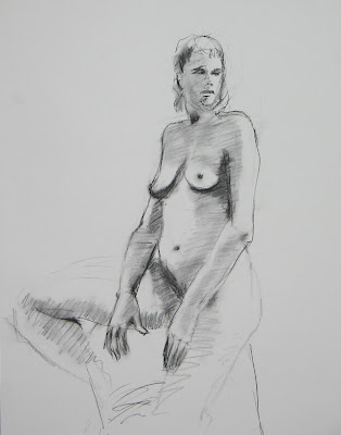
This was actually the last 15 minutes of the evening, a quick charcoal on smooth paper - kind of like a cool down, from a tough workout!
Wednesday, December 5, 2012
Not a great drawing, but if you could see it in person, the pastels becomes almost creamy in texture on this paper and it creates a painterly effect - something I will work with in future. It's funny, for every artist there is a unique way to work with this medium (as it is every medium I guess), but standards and rules are more typically followed. I always kind of assumed that papers designed for pastels - many of them have a gritty surface to provide tooth for the pastel to hold onto - would be best for the pastel. But I so like this creamy texture, and so far have not lost much pastel! More to be discovered!
12-4-12 Drawing night
I bought some different paper by accident. I had intended to buy some Strathmore 400 series medium drawing paper, and I got Strathmore 400 series smooth paper, suitable for pen and ink. I first thought "Oh Phooey!" - I don't want to go to all the trouble of taking it back, so I decided to try it. It has a very smooth, almost satiny surface and it warms up to charcoals very nicely. As you will see it behaves well in pastels too - who knew?
This is the first warm-up (15 min) drawing with charcoals and smooth paper.
This is the first warm-up (15 min) drawing with charcoals and smooth paper.
Saturday, December 1, 2012
Drawing 11-27-12
It has been quite a while since the wheels came off the cart, and I have been able to create anything I thought was worth looking at. This is the final drawing of the night - the others did not promise this ending. Been struggling with an idea about how to start and develop a drawing in a more "painterly" style with pastels, decided to slow down and look instead of jumping in. Had been practicing just blocking in basic areas of color specifically lights and darks, and then refining as time permitted. -This has been good practice but not producing exciting drawings, or even completed drawings, and things have been looking pretty stiff in spite of the idea of loosening up. So in complete frustration, I gave up (mostly); just started responding in a more typical way for me - more spontaneous and voila! - the result! I like this one!
Subscribe to:
Posts (Atom)


